Usability Studies

“It is far better to adapt the technology to the user than to force the user to adapt to the technology.”
– Larry Marine

usability-l Web services knew that usability studies would be imperative for the successful redesign of the website. To build a better site we needed to see exactly how students were using it. By user experience standards, watching users interact with the site is “the most effective way of understanding what works and what doesn’t in an interface” (Nielsen, 2014).
Our objectives for the study were simple:

  • How do students navigate through the website?
  • How long will it take to complete a task?
  • Do the libraries naming conventions align with users’ perspectives?

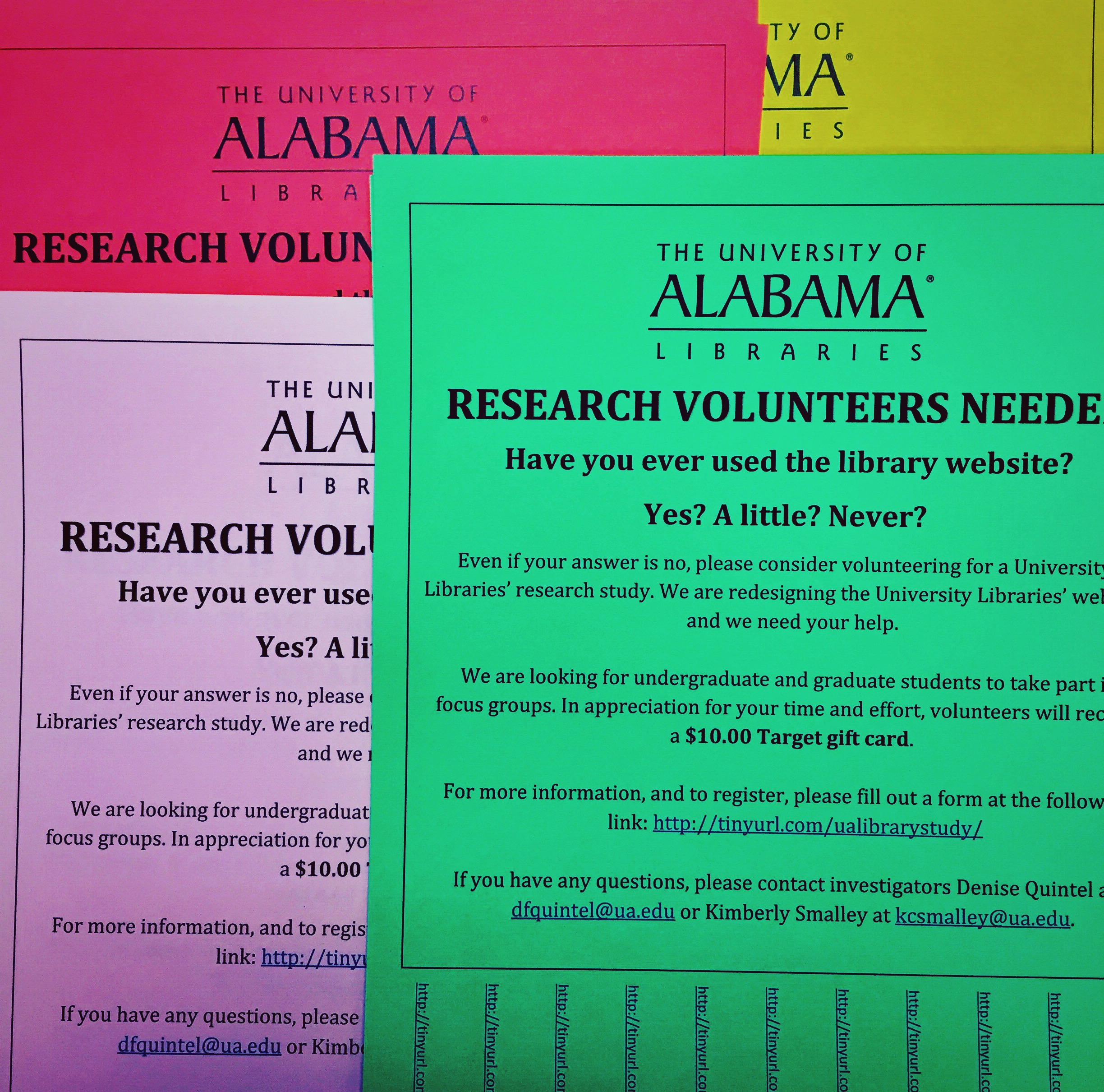
The usability study process started in April, and after approval from the IRB and obtaining generous Target gift card incentives during the summer, we were ready to find our study population at the start of the fall semester. We wanted to test students who had the least experience with the library website, leading us to freshmen and sophomores. We maintained the underlying thought that a website’s navigation should be so universal, that novices and experts alike can find exactly what he or she is looking for. To bring in students for our studies, we advertised everywhere; flyers for participation in Week of Welcome orientation bags, posted calls on LibGuides, and flyers in lecture and residence halls across campus.

IMG_0423

Tasks
To get started, we included a brief survey about website usage and knowledge. We then tested students on our current site, asking if they could complete various tasks. Tasks were common question or situations that a student would face at the library. A few examples:

  • Locate tomorrow’s opening hours for Bruno.
  • Find instructions on how to print.
  • Locate the contact information for the circulation desk.
  • Locate a subject guide that is specific to your major.
  • Where is the 3D printing studio located?

We allowed students to take as much time to complete tasks, but also had a time-limit to determine successful or incomplete tasks, which was anything over 2:00 minutes. Students were unaware of the time limit. As designers of the navigational structure of the site, we felt that spending more than 2:00 minutes to locate basic information would be a failure in the design. We also asked students to talk aloud during their tasks, and express their frustrations, concerns, or other comments about the interaction.

For navigation testing, we needed to test on at least 5 participants. Jakob Nilesen, a well-known usability expert, discovered years ago that 5 users could point you to at least 85% of the issues of the site. Of course, we would have preferred to test a larger group of students, but determined that a small group would help us see what the more obvious issues of the site are, especially for basic user tasks. If a majority of users had the same issues and frustrations with the identical tasks, then that would be a good indication to review content. Not to worry though, usability studies will now be a part of the workflow as the website changes over time.

Observations

  • Students preferred to browse for an answer rather than search, and resorted to search only after all other options had been exhausted.
  • Students could not determine that the library header linked to branches and found it very confusing
  • Students used the left-hand menu to navigate, and seldom used the main content area
  • If unsure of an answer, students always visited “Need Help?” or “Ask a Librarian”
  • Multiple participants used Scout as a site search and demonstrated unfamiliarity with the functions of Scout
  • If students could not find an answer between 00:30 and 01:00, they would often give up the task.

The most common incomplete tasks are as follows:
(Bold entries indicate tasks directly related to site navigation or design)

  1. Find today’s issue of “The International New York Times”
  2. How long can an undergraduate check out a book?
  3. Where is the 3D printing studio located?
  4. Find the journal “Science”
  5. Find a video tutorial on how to search “Scout”
  6. What do you do if you have problems logging into online resources?
  7. Locate a research guide that is specific to your major.

We observed that branch specific information and inconsistent link names made it difficult to locate information. Students seemed to expect that similar types of services or resources would be located together. A few examples:

      • Computers with software
      • Audio and visual equipment to check out with circulation/borrowing
      • Research guides linked with subject liaisons
      • Tutorials related to a topic to be included with that specific topic/area

When students used the search bar, they would enter their query into Scout, and then continue searching anything and everything once they reached the Scout interface. Also surprising was how little students interacted with the main content area, and the overwhelming preference to use the left menu bar. Students seldom used the tabbed options on the search bar (Scout, Databases, E-Journals, Digital Archives, and Site).

Card Sorting IMG_0630
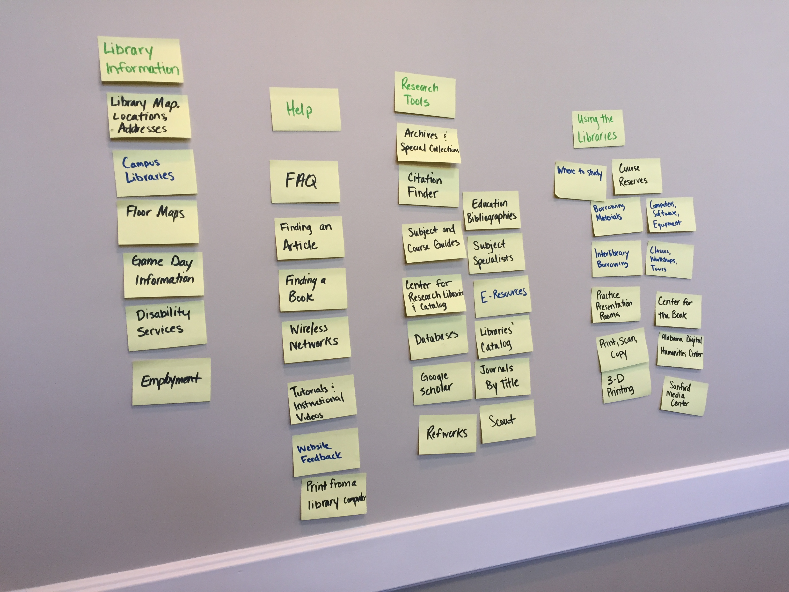
We ran three card-sorting sessions to see how students reacted to certain terms from the library site. We are still scheduling these sessions, but there were a few front-runners for content labels.
As top-level navigation categories, students prefer:

      • “Using the Libraries” over “Services”
      • “Research Tools” over “Research”
      • “How Do I…?” over “Library Help”.

The trend seems to be choosing specific names with actionable behavior, over vague terminology.
Not only did we see the choice for specific and actionable terms, but we also saw students combining content areas for simplification. For example:

      • “Where to Study? ” over “Group Study Rooms” and “Study Carrels”
      • “Classes, Workshops, and Tours” over “Library Instruction” and “Workshops”

Overall, the Web Services team found the usability sessions to be incredibly informative. By watching students interact with the site, it was easy to see what aspects of the design needed to change, such as better explanations about services or resources, consistent font types and sizes, consistent link names, navigational menus, front page content. grumpy-cat-meme-website-awful Users still seek a more streamlined website experience that is easier to navigate and interact with on a regular (and often, irregular) basis.

It is the mission of our department to create a website that provides easy access to library resources and services. The processes laid out for this redesign will help us achieve that mission and we can provide users with a website that successfully places them at the center of the design.

References
Nielsen, Jakob. (2000, March 19). Why You Only Need to Test With 5 Users. Retrieved from http://www.nngroup.com/articles/why-you-only-need-to-test-with-5-users/
Nielsen Norman Group. (2014, January 12). Turn User Goals into Task Scenarios for Usability Testing. Retrieved from http://www.nngroup.com/articles/task-scenarios-usability-testing/

Images
www.worldusabilityday.org
www.grumpycatpics.com

The Library Website Redesign – An Introductory Post

In December of 2013, Web Services and the Web Infrastructure group were given a mandate to begin a ground-up redesign of the library website, starting with changing the basic technologies that run the website (eg, moving to a new content management system) to the design, navigation, function and structure.

This mandate required an extensive amount of planning and preparation – the general rule of thumb in the web design world is (a) don’t ever burn down the village and rebuild but (b) if you do, plan on taking 18-24 months to develop your product to a releasable point.

The process was comprehensive – the Web Services unit engaged in comprehensive usability testing, web statistics analysis and user behavior data gathering over the course of 9 months in an effort to determine the actual needs of the students to guide the re-design efforts. The units researched content management systems and measured various systems against desired attributes and criteria; the units worked to transfer every single page and structure to the new sites; the technology infrastructure group developed test servers and servers, rewrote applications and migrated server content to OIT servers; the Web Services unit migrated content, and developed charter documents, style guides, etc. Both units worked together to develop guiding principles, documents to guide design and structure, and then (as mentioned previously) the design, navigation, technologies and structure of the site itself.

So, as many have been wondering, what specifically have we been up to?

Here are the highlights:

New CMS and server environment.
Over a period of ~4 months, we evaluated a lengthy list of content management systems before installing 3 locally to test (drupal, Modx and WordPress) against a comprehensive list of criteria. It was close, and each CMS offered something the others did not, but ultimately WordPress prevailed due to its robust release schedule, supporting user and developer network and ease-of-use for the end user (among other factors).

Usability testing.
Over the course of the fall semester, we submitted two IRB proposals to engage in usability testing of libguides, the current library website, and all other web properties. Using a gift card as an incentive, we conducted a number of sessions looking at student attitudes towards current website, the usability of the navigation, the terminology used on the site, the location of items, the graphic design, etc.

We asked students to locate items and website areas, perform searches, and to complete a variety of tasks which were timed, and recorded as movies using a usability software suite.  Students also were given surveys and questionnaires, and tested specific application sections such as hours or the tabbed search interface. Usability was also permanently integrated into our processes, and will be an ongoing activity as we iteratively test and change website elements over time.

Peer Surveys
Web Services spent extensive time developing a Carnegie Classification list of cohort institutions as well as a peer list of ACRL library websites, whose sites were then extensively analyzed for usability methods, design models, navigation elements and terms, and structure and layout, with many of the ‘best practices’ incorporated into our model and plans.

Statistical analysis
We used Google Analytics to view and analyze over 4 years worth of web usage statistics, focusing not only on raw data (such as which pages were used how much) but also on bounce rates, landing pages, referrers, and testing our stated website goals. Analytics has also been integrated into our processes, and will be used on a regular basis to perform A/B testing, and measure stated goals, track user behavior as it relates to specific pages, measure navigation effectiveness, etc.

Re-written web applications
Every application that exists on the web site (Music Video database, the hours application, the databases search, etc. has been partially or extensively re-written)

Simplified user interfaces, website structure and navigation
Through our usability and survey data, the students have told us they want the site to be simplified and easier to use, with a reduction in library jargon and a structure that reflects their functional activity and not the library’s administrative structure. So to that end, the web team has been re-designing interface elements, structure, navigation, content and design to reflect and accomodate these needs. The result will be a site that the user not only asked for, but has qualitatively tested as easier to use and more efficient.

University Libraries Style Guide
Based on the University’s initial web style guide, the Web team has been developing a style guide that will codify all of our interface elements, and, for the first time, provide specific, written style guidelines and usage instructions for content creators.

Content strategy
Why do we have certain content on the website? Does it support the website mission? The library mission? What content is acceptable and what is not? What is the purpose of the content? Should the content be relocated and / or merged with our content? Does it meet quality standards? Is it web written? A content strategy answers all of these questions and more, and guides content creation, deletion, and alteration on a website. The web team has developed (and is still developing) a comprehensive content strategy for the library website along with a content audit document to maintain and track content parameters so that we know what we have and why it is there.

Focus on the single search
A significant focus of the new site will be a something that is a relatively new development in the library world -the ‘Bento box’ meta search – essentially, the removal of the tabbed search box interface (eg, our current site, and many others) and its replacement with a true ‘single’ search that – using a combination of API services – searches every resource and tool to which we have access:

  • The website, libguides, and ask-a-librarian via the Google search API
  • Serial Solutions 360 data
  • The library catalog
  • EDS
  • The databases  application

Our usability research has shown that students will use the default tab on our front page search box (which is Scout) for any purpose or search regardless of task. If asked to find a database by title, or an article or a book, or an item on the website, or an FAQ item, etc., the student will generally conduct a search from the initial starting tab. They do not understand that you need to click the different tabs to perform functionally different searches, therefore their results are often incorrect or misleading and they then generally give up and stop their information-seeking behavior.

The obvious way to correct this erroneous search behavior is to provide them with (a) only one search box, (b) force that search box to communicate with all of our possible resources, and (c) allow the user to review the results from all resources combined into a single page, allowing them to choose the most relevant result, post-search instead of pre-search.

Graphic Design
Yes, the website was getting a tad bit dated-looking. So the look-and-feel is undergoing an evolving graphic design update that is predicated and underpinned by the user research and usability data.

Mobile-first responsive design
According to the Pew Internet Trust, the majority of users now access the internet from a mobile device (phone, tablet, etc). A significant majority of younger users have *only* used a mobile device, and rarely if ever have the opportunity or need to access the internet on a standalone desktop or laptop computer.  To accommodate this development, the web design world has developed a variety of tools to support a design methodology know as ‘responsive design.’

Responsive design  focuses on making sure your website is compatible with all devices of all sizes through the use of various javascript and CSS libraries to perform compatibility actions such as the resizing of elements, the migration of elements to different locations on the screen, the changing of font sizes etc – all in response to screen size/device type – hence the name ‘responsive.’  The UA libraries website is implementing this design method in the new site, as are most library websites.

Where are we headed?
Nov 22-30th – initial alpha release – structure, first alpha of the website template design, and our top-level pages should be completed along with the integration of the first version of the one search / bento search, and the integration of all of the web applications along with the first hours alpha. An updated timeline will be placed on this blog shortly, with future release schedules.

We will update this blog with every new communication. We also have an enormous amount of usability data and working documents which we will share with everyone shortly.

Selected Citations:

Modeling a Library Website Redesign Process: Developing a User-Centered Website through Usability Testing
Danielle A. Becker and Lauren Yannotta

The Website Design and Usability of US Academic and Public Libraries
Anthony S. Chow, Michelle Bridges and Patricia Commander

How Users Search the Library from a Single Search Box
Cory Lown, Tito Sierra and Josh Boyer