“It is far better to adapt the technology to the user than to force the user to adapt to the technology.”
– Larry Marine
 Web services knew that usability studies would be imperative for the successful redesign of the website. To build a better site we needed to see exactly how students were using it. By user experience standards, watching users interact with the site is “the most effective way of understanding what works and what doesn’t in an interface” (Nielsen, 2014).
Our objectives for the study were simple:
- How do students navigate through the website?
- How long will it take to complete a task?
- Do the libraries naming conventions align with users’ perspectives?
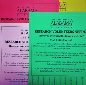
The usability study process started in April, and after approval from the IRB and obtaining generous Target gift card incentives during the summer, we were ready to find our study population at the start of the fall semester. We wanted to test students who had the least experience with the library website, leading us to freshmen and sophomores. We maintained the underlying thought that a website’s navigation should be so universal, that novices and experts alike can find exactly what he or she is looking for. To bring in students for our studies, we advertised everywhere; flyers for participation in Week of Welcome orientation bags, posted calls on LibGuides, and flyers in lecture and residence halls across campus.
Tasks
To get started, we included a brief survey about website usage and knowledge. We then tested students on our current site, asking if they could complete various tasks. Tasks were common question or situations that a student would face at the library. A few examples:
- Locate tomorrow’s opening hours for Bruno.
- Find instructions on how to print.
- Locate the contact information for the circulation desk.
- Locate a subject guide that is specific to your major.
- Where is the 3D printing studio located?
We allowed students to take as much time to complete tasks, but also had a time-limit to determine successful or incomplete tasks, which was anything over 2:00 minutes. Students were unaware of the time limit. As designers of the navigational structure of the site, we felt that spending more than 2:00 minutes to locate basic information would be a failure in the design. We also asked students to talk aloud during their tasks, and express their frustrations, concerns, or other comments about the interaction.
For navigation testing, we needed to test on at least 5 participants. Jakob Nilesen, a well-known usability expert, discovered years ago that 5 users could point you to at least 85% of the issues of the site. Of course, we would have preferred to test a larger group of students, but determined that a small group would help us see what the more obvious issues of the site are, especially for basic user tasks. If a majority of users had the same issues and frustrations with the identical tasks, then that would be a good indication to review content. Not to worry though, usability studies will now be a part of the workflow as the website changes over time.
Observations
- Students preferred to browse for an answer rather than search, and resorted to search only after all other options had been exhausted.
- Students could not determine that the library header linked to branches and found it very confusing
- Students used the left-hand menu to navigate, and seldom used the main content area
- If unsure of an answer, students always visited “Need Help?” or “Ask a Librarian”
- Multiple participants used Scout as a site search and demonstrated unfamiliarity with the functions of Scout
- If students could not find an answer between 00:30 and 01:00, they would often give up the task.
The most common incomplete tasks are as follows:
(Bold entries indicate tasks directly related to site navigation or design)
- Find today’s issue of “The International New York Times”
- How long can an undergraduate check out a book?
- Where is the 3D printing studio located?
- Find the journal “Science”
- Find a video tutorial on how to search “Scout”
- What do you do if you have problems logging into online resources?
- Locate a research guide that is specific to your major.
We observed that branch specific information and inconsistent link names made it difficult to locate information. Students seemed to expect that similar types of services or resources would be located together. A few examples:
- Computers with software
- Audio and visual equipment to check out with circulation/borrowing
- Research guides linked with subject liaisons
- Tutorials related to a topic to be included with that specific topic/area
When students used the search bar, they would enter their query into Scout, and then continue searching anything and everything once they reached the Scout interface. Also surprising was how little students interacted with the main content area, and the overwhelming preference to use the left menu bar. Students seldom used the tabbed options on the search bar (Scout, Databases, E-Journals, Digital Archives, and Site).
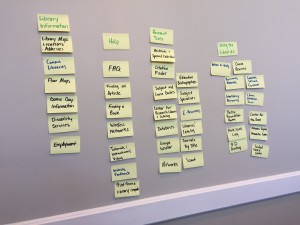
Card Sorting 
We ran three card-sorting sessions to see how students reacted to certain terms from the library site. We are still scheduling these sessions, but there were a few front-runners for content labels.
As top-level navigation categories, students prefer:
- “Using the Libraries” over “Services”
- “Research Tools” over “Research”
- “How Do I…?” over “Library Help”.
The trend seems to be choosing specific names with actionable behavior, over vague terminology.
Not only did we see the choice for specific and actionable terms, but we also saw students combining content areas for simplification. For example:
- “Where to Study? ” over “Group Study Rooms” and “Study Carrels”
- “Classes, Workshops, and Tours” over “Library Instruction” and “Workshops”
Overall, the Web Services team found the usability sessions to be incredibly informative. By watching students interact with the site, it was easy to see what aspects of the design needed to change, such as better explanations about services or resources, consistent font types and sizes, consistent link names, navigational menus, front page content.  Users still seek a more streamlined website experience that is easier to navigate and interact with on a regular (and often, irregular) basis.
It is the mission of our department to create a website that provides easy access to library resources and services. The processes laid out for this redesign will help us achieve that mission and we can provide users with a website that successfully places them at the center of the design.
References
Nielsen, Jakob. (2000, March 19). Why You Only Need to Test With 5 Users. Retrieved from http://www.nngroup.com/articles/why-you-only-need-to-test-with-5-users/
Nielsen Norman Group. (2014, January 12). Turn User Goals into Task Scenarios for Usability Testing. Retrieved from http://www.nngroup.com/articles/task-scenarios-usability-testing/
